
Scale it Up Infographic
Making facts on cumulative positive actions add up to action for the Union of Concerned Scientists
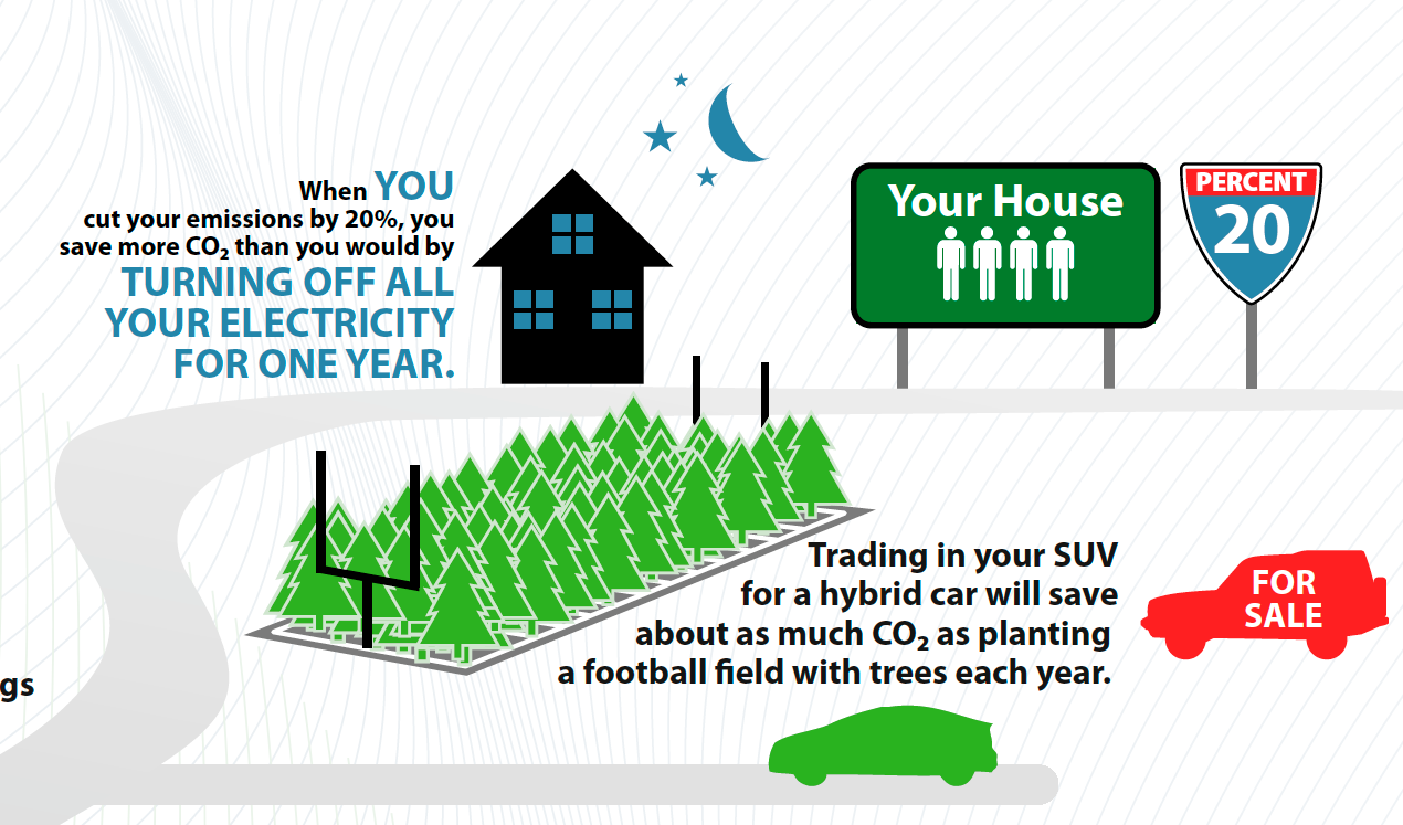
The Watershed Company, a digital advocacy agency, asked us to create an information graphic to visualize how small actions can have big impacts on climate change. Their client, the Union of Concerned Scientists, were introducing a book on the subject, and Watershed was creating an online calculator that people could use to show how things like using a programmable thermostat or eating less meat could help to significantly reduce CO2 emissions. Originally the UCS had conceived of a house graphic, showing all the actions within it that could make a difference. From there the graphic would expand out to show families, friends, cities, and nations doing the same actions to generate large savings in emissions. After one round of this concept, however, it became clear that there was too much to show in one small area like a house. So we visualized those actions within one screen-view of the house level, instead. We maintained a color palette brought over from Watershed's site, and used a consistent style of flat iconic illustrations tied into a road that gets larger with the increase in cumulative positive action. Both Watershed and the UCS loved the graphic, and it has been integrated into their site at coolersmarter.org.
Detail of the house level.

Detail of meat = emissions illustration.

Trees covering Las Vegas!

The whole infographic.